Monday, March 30, 2009

Blue for research, red for development

Color scientists are notorious for surrounding themselves in gray in order not to pollute their retinas with after-images. Typically, the desktop background on their PC is gray so they can make unbiased color judgements.

Color scientists do not spend their day looking at pretty color images. Most of it is spent writing software implementing color rendering algorithms; sometimes they even do some research to come up with new algorithms. There is no imperative need for a gray desktop background.

Recent research by Ravi Mehta and Rui (Juliet) Zhu at the Sauder School of Business, University of British Columbia suggests color scientists should change their PC's desktop to blue when they are conducting research and to red when programming.

From a series of six studies reported in Science 27 February 2009: Vol. 323. no. 5918, pp. 1226 - 1229, they conclude that although people have an overall preference for blue versus red color, red can be beneficial when the focal task requires detailed attention.

The left advert version features visuals that are remotely related to the focal camera product; the right version features visuals that depict specific product details

Red is often associated with dangers and mistakes. They report, claims have been made linking the color red to the highest level of hazard and also the highest level of compliance. In contrast, blue is often associated with openness, peace, and tranquility (e.g., ocean and sky). A word association test confirmed that people indeed generate these different associations to red versus blue color in the cognitive task domain.

[Note that the red and blue may have different associations across cultures. Just replace the color names appropriately.]

Metha and Zhu propose that these different associations related to red versus blue color can induce alternative motivations. Specifically, red, because of its association with dangers and mistakes, should activate an avoidance motivation, which has been shown to make people more vigilant and risk-averse. Thus, red, compared with blue, should enhance performance on detail-oriented tasks.

In contrast, because blue is usually associated with openness, peace, and tranquility, it is likely to activate an approach motivation, because these associations signal a benign environment that encourages people to use innovative as opposed to "tried-and-true" problem-solving strategies. Indeed, an approach motivation has been shown to make people behave in a more explorative, risky manner. Thus, blue versus red should enhance performance on creative tasks.

Indeed, their study shows that red (versus blue) can activate an avoidance (versus approach) motivation and subsequently can enhance performance on detail-oriented (versus creative) cognitive tasks. When the task on hand requires people's vigilant attention (e.g., programming), then red might be particularly appropriate. However, if the task calls for creativity and imagination (e.g., a new product idea brainstorming session), then blue would be more beneficial.

Friday, March 27, 2009

Black

I was recently re-reading chapter 11 on the black printer in Yule's Principles of Color Reproduction [1].

black printer

When in 1719 Jacob Christoph Le Blon invented the principle of trichromatic printing (British patent 423), one of the innovations was his adding a fourth mezzotint engraving plate for a black separation [2]. The black separation simultaneously solved a number of problems:

  • since a gray component is present in a large portion of each image, the black separation can be used as a registration key (therefore the abbreviation K)
  • when the gray component is removed from the chromatic layers, these are thinner and therefore use less of the more expensive color inks
  • in addition, the drying time is shorter (ink limits) and the press can be run faster, further reducing cost
  • the gray balance is improved, more robust, and the blacks are cleaner
  • last but not least, the gamut is considerably extended for dark colors

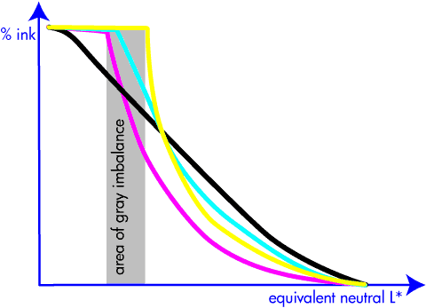
The first step in characterizing (i.e., determining the color transformation for) a color printer is to balance the grays. After this step, we know how much cyan, magenta, and yellow ink we need to print to obtain each gray level. Because yellow ink is lighter than cyan and magenta ink, we achieve a maximum gray level where we use the maximum amount of yellow, when there is still room to add cyan and actually only about half of the magenta ink is used.

The tone range from maximum magenta, cyan, yellow to maximum yellow is called the area of gray imbalance, because no gray can be produced. Adding a black separation, the tone range can be increased to include the area of gray imbalance.

Actually, because the black ink is much darker than even magenta, by going all the way to full black, the tone scale can be considerably extended in the range of dark colors.

area of grey imbalance

First a note on terminology. The gray component of a pixel's color was defined by Yule as the amount of the least predominant ink, i.e., min (C, M, Y). In gray component removal (GCR), this minimum was subtracted from the CMY coordinates and formed the black printer. Making room for black by reducing CMY by any other amount was called undercolor removal (UCR). Today the term UCR is no longer used and the term GCR encompasses both the original GCR and UCR.

The gray component replacement function (or simply black function) is difficult to optimize. Three regions in the tone scale are difficult: the dark colors, the light (right) edge of the area of gray imbalance, and the light colors.

Of the three, the middle tone region at the light edge of the area of gray imbalance is easiest to solve. Indeed, the constraint is that the black function must be smooth, i.e., not start abruptly.

In the dark region, the black function is determined by a trade-off between richness of the blacks, ink limits, and the ink cost. Because the shadows are darkened, their contrast is reduced and consequently the contrast has to be exaggerated in the shadows to preserve shadow detail visibility.

By making the middle region smooth, part of the gray component is removed in the light tone range. Normally the substrate on which we print is white. A lighter tone means that less ink is deposited, which in turns means that more white is added. Adding white to a color desaturates it, therefore an aggressive black function will yield a print lacking saturation [3, 4].

By avoiding black ink in light tones, a larger area of the substrate is covered with ink (hiding white), and because of simultaneous contrast, the perceived color is more vivid. This is somewhat related to a skeleton black ([1] p. 286), where such a black printer is used, but without UCR.

However, avoiding black in light tones introduces a complexity in designing the halftoning algorithm, because the simultaneous contrast also amplifies the perceived color error. Therefore, a poor halftoning algorithm requires more accuracy in the color transformation, while a good halftoning algorithm allows for larger tolerances in the color transformation, as well as in the printer stability.

The above information is purely historical. When Kodak's Yule wrote his book, my PC was an Olivetti P101 with 9 registers of data memory, program memory for 120 instructions, and processing speed limited by the time it took a register's mechanical wave on the memory wire to reach the reading terminal, probably running at a few dozen IPS. When Mik and Dusty wrote their report, my PC was a Dorado, with 4M bytes of memory and 1 MIPS. Today I have an HP xw4600 with 2G bytes and running at about 2000 MIPS.

Because of this incredible increase in performance, on today's computers we can compute a fancy black printer using algorithms based on computational and differential geometry models. While in the past we were limited to colorimetry based on aperture colors for color correction, now we can take spatial (complex) color into consideration. This is why today we get such and exceptional color print quality at such a low cost.

If you wrote or read a good recent paper on this subject, share it as a comment to this post.

  1. John A.C. Yule, Principles of Color Reproduction, Wiley, New York, 1967
  2. J.D. Mollon, "The Origins of Modern Color Science", in The Science of Color (Second Edition), Steven K. Shevell editor, Elsevier Science, 2003
  3. Michael G. Lamming and Warren L. Rhodes, Towards "WYSIWYG" Color, Xerox PARC Technical Report EDL-88-2, P87-00018, April 1988
  4. Michael G. Lamming and Warren L. Rhodes, "A Simple Method for Improved Color Printing of Monitor Images, ACM Transactions on Graphics, 9, 4, October 1990, 345-375

Monday, March 23, 2009

Mimosa

mimosa color

When I was a pupil in elementary school, our teacher Mr. Egidio Bernasconi used to give us mimeographed blank maps that we had to complete. One such map had the streets of Besso (a.k.a. Lugano 3) and from time to time he would give us the name of a plant we had to learn to recognize, find in the quarter, and mark on the map.

I still remember that for a mimosa pudica I had to go to via Coremmo, just a stone throw from school. I wish I had such a map today. Yes, now we have powerful search engines that allow us to find everything we need to know. However, searching the Web for a mimosa in Palo Alto just returns a company providing information immediacy, discovery and continuity for the new generation of critical enterprise information; and of course a number of local establishments serving mimosa cocktails.

I quickly walk a couple of blocks to Gamble Garden, camera in hand. Unfortunately, I do not find a mimosa. However, a major nursery is just a short drive away. Yet, they never heard about a plant called mimosa. How can they not know a mimosa pudica? It is so magic for children: you can touch a leave and it just shamefully closes.

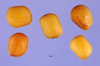
A quick check in The Jepson Manual of higher Plants of California reveals its absence in the index. Hence, it does not exists here. In fact, the USDA database reveals that in the US, this mimosa is limited to Florida, Hawaii, Maryland, Virginia, Puerto Rico, and the Virgin Islands. Therefore, at his time I can only offer this canned picture, credits Steve Hurst @ USDA-NRCS PLANTS Database:

Steve Hurst @ USDA-NRCS PLANTS Database

Another proof that navigating is much more powerful than searching. Instead of finding 27,300 pages for my search, the engine should have told me "dummy, it does not grow here!"

Why was I looking for a mimosa in the first place? Every year, Pantone announces the color of the year. Last year it was blue iris, which I quickly found at Gamble Garden. This year is is mimosa, which I figured should bloom about now and therefore now would be the time to blog about it.

mimosa color

In their press release, Pantone describes mimosa as a warm, engaging yellow. They write: "In a time of economic uncertainty and political change, optimism is paramount and no other color expresses hope and reassurance more than yellow."

Leatrice Eiseman, executive director of the Pantone Color Institute, continues: "The color yellow exemplifies the warmth and nurturing quality of the sun, properties we as humans are naturally drawn to for reassurance. … Mimosa also speaks to enlightenment, as it is a hue that sparks imagination and innovation."

In the press release, Pantone concludes: "Best illustrated by the abundant flowers of the Mimosa tree and the sparkle of the brilliantly hued cocktail, the 2009 color of the year represents the hopeful and radiant characteristics associated with the color yellow. Mimosa is a versatile shade that coordinates with any other color, has appeal for men and women, and translates to both fashion and interiors. Look for women's accessories, home furnishings, active sportswear and men's ties and shirts in this vibrant hue."

Now let me don that mimosa tie I bought on my last business trip to Bergamo and go out for a mimosa. The blue flowers are a nice touch to last year's color, so I guess this is a transitional tie.

my tie

By the way, the cherries at Gamble Garden are about to burst out in さきみだれる. Get ready for the cherry blossom viewing or お花見.

cherry blossom, sakura, hanami

Friday, March 20, 2009

Patch your computers

Tomorrow is the first day of spring. This is a good time for spring cleaning — patch all your computers and your applications, make sure your firewalls are up, your WiFi networks password protected, etc. As John Markoff writes in a recent New York Times article (subscription required), a major botnet worm called Conficker might be released on April first, and you want your computer to be safe. After all, you will need it that day to enjoy all the April fool’s pranks.

Thursday, March 19, 2009

Paper sizes (formats)

In the office printing business we are so used to the generalization that all paper is letter size, that we often forget that is just one size in which we can buy cut sheet paper. Here is a handy compilation of popular sizes.

A series (main series)

A0 is 1 square meter. Formula: h = w * sqrt (2), i.e., the ratio of the sides is sqrt (2).

This is the normally used series.

A number size (mm) size (inch) area (m^2)
A0 841 x 1189 33.1 x 46.8 1.0
A1 594 x 841 23.4 x 33.1 0.5
A2 420 x 594 16.5 x 23.4 0.25
A3 297 x 420 11.7 x 16.5 0.125
A4 210 x 297 8.3 x 11.7 0.063
A5 148 x 210 5.8 x 8.3 0.031
A6 105 x 148    
A7 74 x 105    
A8 52 x 74    
A9 37 x 52    
A10 26 x 37    

B series (auxiliary series)

B0 is 1 m long on the short side.

This series is sold only in cut sheets (in plano) and can be used only if the required size is not available in the A series.

C series (intermediary series)

Geometric average between series A and series B. Example: C4 = sqrt (A4 * B4).

This series has been designed especially for envelopes and other mailing containers.

DIN Summary in mm

Class Series A Series B Series C Series D
0 841 x 1189 1000 x 1414 917 x 1297 771 x 1090
1 594 x 841 707 x 1000 648 x 917 545 x 771
2 420 x 594 500 x 707 458 x 648 385 x 545
3 297 x 420 353 x 500 324 x 458 272 x 385
4 210 x 297 250 x 353 229 x 324 192 x 272
5 148 x 210 176 x 250 162 x 229 136 x 192
6 105 x 148 125 x 176 114 x 162 96 x 136
7 74 x 105 88 x 125 81 x 114 68 x 96
8 52 x 74 62 x 88 57 x 81 48 x 68

Old European Formats

These formats were in use before the normalization and can still be found today in the graphic arts. This is just a selection in plano (= unfolded) papers. When the papers are folded, the name is prefixed by the folding number (e.g., in 4º Jésus refers to the Jésus format folded in four); usually the Latin names are used:

  • in folio, 2 sheets or 4 pages
  • in quarto, 4 sheets or 8 pages
  • in octavo, 8 sheets or 16 pages
  • in 16, etc.
Designation size (cm)
Couronne édition 37 x 47
Double pot 40 x 62
Coquille 44 x 56
Double Tellière 44 x 66
Carré 45 x 56
Couronne 46 x 72
Raisin 50 x 65
Raisin offset 51 x 66
Jésus 56 x 76
Double coquille 56 x 88
Double carré 56 x 90
Jésus offset 58 x 78
Carré offset 58 x 90
Colombier affiches 60 x 80
Colombier 63 x 90
Double raisin 65 x 100
Double raisin offset 66 x 102
Double Jésus 76 x 112
Double Jésus offset 78 x 112
Double Colombier 80 x 120
Quadriple carré 90 x 112

American Paper Sizes

Designation  size (in)
atlas
26 x 24
imperial
22 x 30
elephant
20 x 27
royal
20 x 25
small royal
19 x 25
medium
18 x 23
demy
17.5 x 22.5
crown
15 x 20
foolscap
17 x 13.5
pot
12.5 x 15.5

European Form Sizes

Class size (mm)
0 500 x 700
I 560 x 830
II 610 x 860
III 650 x965
III b 720 x 1020
IV 780 x 1120
V 890 x 1260
VI 1000 x 1400
VII 1100 x 1600
X 1400 x 2000

ANSI Paper Sizes

Designation size (inch)
A (letter) 8.5 x 11
B (tabloid) 11 x 17
C 17 x 22
D 22 x 34
E 34 x 44

ARCH Paper Sizes

Designation size (inch)
A 9 x 12
B 12 x 18
C 18 x 24
D 24 x 36
E 36 x 48

Favorite Cut Sheet Media

These are in plano formats common in the electronic printing industry.

Designation U.S. market (inch) metric market (mm)
US letter / ISO and JIS A4 8.5 x 11 210 x 297
US executive 7.25 x 10.5  
US legal 8.5 x 14  
ISO and JIS A5   148.5 x 210
JIS B5   182 x 257
Postcard 4 x 6 102 x 152
Greeting card 8.5 x 11 scored
(folds to 8.5 x 5.5)
210 x 297 scored
(folds to 210 x 148 )
Note card 5.5 x 8.5 scored
(folds to 5.5 x 4.25)
148 x 210 scored
(folds to 148 x 105 )
US index card
ISO and JIS A6 card
4 x 6, 5 x 8 105 x 148
Calendar kit 8.5 x 11 210 x 297
Hagaki (postcard)
葉書大「はがきだい」
  100 x 148
Oufuku-hagaki (return postcard)
往復葉書 「おうふくはがき」
  148 x 200

Favorite Envelope Sizes

Envelope description Envelope size
US commercial-10 4.125" x 9.5"
International DL 110 mm x 220 mm
International C6 114 mm x 162 mm
US A2 4.375" x 5.75"

Page Length Line Values

Paper Size  6 lpi 8 lpi
Letter 66 88
Legal 84 112
A4 70 93
Executive 63 84

American Paper Weights

onion skin
9 lb.
mimeograph paper
16 lb.
standard typing paper
20 lb.
standard letterhead paper
24 lb.
good for printing on both sides
60 lb.
business cards and postcards
65 lb.
coated magazine stock
100 lb.
poster board
120 lb.

Monday, March 16, 2009

Patents versus markets

The latest printed issue of Science has a surprising article on the promotion of intellectual discovery. The link is Science 6 March 2009: Vol. 323. no. 5919, pp. 1335 - 1339. The Science editors considered this a significant report, giving is a Perspective article. The researchers found that their "markets system" performed better than the patent system.

I used the qualifier "surprising" because this is a strange time to advocate free markets instead of regulation, a time when the G20 members this weekend were in London to discuss increased regulation of the financial markets. I think the key in this argument is in the concept of the transitioning organization and its attractiveness for psychopaths as Hare and Babiak explain in they book Snakes in suits, written in the aftermath of Enron. In essence, you cannot assume all players are honest and have a conscience — you need a mechanism to cater for dishonest players, and regulation & oversight can be an effective mechanism.

The perspective article in Science list some caveats from the economist's point of view. Let me add some caveats from an inventor's point of view.

As we are now learning in the current global crisis, optimizing for short-term gains is not a robust strategy. Instead, the optimization should be for long-term success. In their paper, Meloso et al. run the experiment for a few minutes and then close the market for the day to tally the gains and losses.

Innovation runs on a very long time scale. In my experience, valuable inventions in a research lab can take 10 or more years to become commercially relevant for their assignee. In fact, technology and society have first to evolve to a point where the decision makers can grasp the significance of an invention. Then engineering has to learn the new technology and develop products. Marketing and sales staff has to be trained, along with customer support. Only then, the new technology can be advertised and brought to market with a chance of recuperating the investment and generate profits, hopefully to invest in new inventions and not in personal jets.

Patent applications are often filed to generate a big portfolio that can be used in cross-licencing negotiations, so quantity is often more important than quality. This means that the original managers deciding on an application can incorrectly guess which aspects of an invention have long-term value and should be protected, thus instructing the patent attorneys to make the strategically incorrect claims, reducing its commercial value. The proposed market model cannot account for this.

If an invention is important for the long-term technology strategy of a company, the company must keep working on it for the required decade or so, continuously filing patent applications as it refines the invention, so it will have a strong patent portfolio.

Wednesday, March 4, 2009

The quest for publication credits

Donald C. O'Shea, editor of Optical Engineering, wrote an interesting editorial in the last issue of his journal. The editorial is open access here. Note how — unrelated to the economy — publishing is getting harder as journals fight to increase their impact factors. Here at HP Labs we are actors in this game as we move from journals with lower impact factor to to those of higher impact factor to get first tier credit.

Note also in Table 5 the general shift of research from North America to Asia. As for countries, this is a shift from the United States of America (USA) to the People's Republic of China (PRC) and the Republic of China (ROC).

Related to the economy is that conferences are extending the submission deadlines. However, often this is not due to a smaller number of submissions. Indeed, submission numbers are up. The problem is that almost all submissions are for posters, with only very few for oral presentation.

In summary, the easiest path to performance credits is to submit oral papers at first tier conferences within driving distance. Location matters!

Hang in there!