Tuesday, December 15, 2015

OLED TVs are here

OLED displays for handheld devices have been around for a while, but large TVs have been rare due to manufacturing difficulties. LG group has been one of the few manufacturers. At the end of October, Panasonic has introduced a 65 inch 4K ultrahigh definition TV in Europe. It combines LG's OLED panel with Panasonic's image processing technology.

Despite a high price of 10,000€, the TVs are selling well. If in the past the rule was that your display can never be too bright, now the rule is that your display's gamut is never too big.

Link to article

Wednesday, October 28, 2015

Data Science Camp

Last Saturday (October 24, 2015) was SF Bay ACM's annual Data Science Camp Silicon Valley. The venue was the Town Hall in PayPal's intergalactic headquarters on 2161 North 1st Street in San Jose, nestled between eBay and Apple's future Car Division, just one block from Comet, Foveon, Lumileds, Peaxy, and Toyota's research lab.

From the voting on the sessions, it appears that the event attracted data scientists from all over the US, with a large number of participants people who had taken the Coursera classes on big data, machine learning, and data science and were now wondering how to progress from Coursera to a job (82 votes). As Sara Kalisin from Intel noted, when companies try out analytics, they do not really know what to do with the result and end up not staffing the project because the benefit is less than the employee's salary. In addition to the session on "Coursera to job," Sara also led a session with title "How to showcase data
science impact" (15 votes).

At the beginning of the day, Joseph Rickert and Robert Horton of Microsoft gave the tutorial "Introduction to R for Machine Learning." R, which goes back to Bell Labs in 1976, has become the most widely used data analysis software. It is undergoing an astonishing growth and today has about 36,820 functions. The CRAN repository has a solution for almost all data analysis problems.

Originally, R was a statistical package with statistical tools acting on observations stored in arrays. There were different packages, like Weka, for mining large data sets stored in files with machine learning to classify patterns and make predictions. However, today R has all the machine learning functionality on top of the original statistical tools. This has been possible because today a serious workstation has at least 64 GB of RAM, which allows to store big data in arrays.

When the data is too large to fit in memory, it can be partitioned into blocks which can be processed sequentially or in parallel. However, this capability is not available with the free version of R and requires the expensive commercial enterprise version. Robert Horton announced that SQL Server 2016 will support the server-side execution of R functions. This means that the data no longer will have to be moved across the network for analysis.

After the sponsored lunch, John Park from HP led a double session with title "Malware Classification +
ML + Crowd Sourcing" (46+44 votes). The amount of malware injected every day is mind-boggling. He uses an algorithm called Nilsimsa Hash on the binary files and uses natural language processing and classifiers trained through crowd-sourcing to find the malware.

Another very popular session with the title "I have data. Now What? IOT wearable space in life sciences. How to analyze the data for individual users. How do we build that" (117 votes) was led by Lee Courtney from Qurasense. Representatives from large international financial institutions and the health care industry participated in this interactive session. The only company permanently storing all data and continuously mining all of it was a manufacturer of set-top boxes for the cable industry.

For everybody else, storing the data was just too dangerous because of the flood of malware, while Hadoop has no security. This requires ingesting the data, mining it, then deleting it. Because the HDFS data ingest is very slow and each file must be stored in three copies, as little data as possible is preserved. At the end of the session, Lee Courtney summarized the top three unsolved problems for big data as

  1. no security
  2. no security
  3. poor ingest performance

As a note, there are file systems with excellent security and supporting HDFS. They have a POSIX interface, so it is not necessary to move the data at all.

Moving the data is a big problem that will not go away, as illustrated by this figure by DataCore. Until about eight years ago, processors kept getting faster. However, when the wall of physical transistor shrinking was hit, the clock rates actually became slower to control the heat generation and allow for more cores on each die. With the increasing number of cores—for example, a typical workstation processor has eight cores each with two hyperthreads, for a total of 16 cores—less IO bandwidth is available to each CPU: the number of pins on the chip is still the same, and there is a growing IO gap.


The IO gap is rapidly increasing

Some people believe that cloud computing and virtual machines solve the problem. However, for storage this is an illusion. Indeed, according to the Hennessy/Patterson rules of thumb, for general computing the utilization rate is about 0.20–0.25 [HOHY14]. For storage servers, the utilization rate is 0.6–0.8 [AFG+10], therefore statistical multiplexing is less useful because with the OS and hypervisor overheads a processor is maxed out. The IO gap comes on top of this!

[AFG+10] Michael Armbrust, Armando Fox, Rean Griffith, Anthony D Joseph, Randy Katz, Andy Konwinski, Gunho Lee, David Patterson, Ariel Rabkin, Ion Stoica, et al. A view of cloud computing. Communications of the ACM, 53(4):50–58, 2010.

[HOHY14] Md. Iqbal Hossain (Older) and Md. Iqbal Hossain (Younger). Dynamic scaling of a web-based application in a cloud architecture. Master’s thesis, School of Information and Communication Technology, KTH Royal Institute of Technology, Stockholm, 2014.

Thursday, October 22, 2015

Photonics for data access and delivery

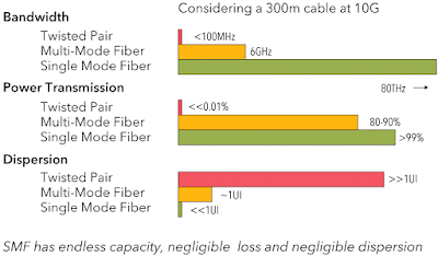
When we use the cloud for heavy duty computations, we quickly find out that although storage is inexpensive, we never know how fast we can access our data. If we want guaranteed performance in terms of IOPS, the price quickly goes up. This has to do with the distance the data has to travel. In a warehouse-scale datacenter, we have two cabling lengths: up to a couple meters for vertical networking in a rack and up to a couple hundred meters for horizontal networking between racks. There are some game-changing technology developments on the horizon regarding the horizontal networking.

For the vertical cabling, copper can be used, but for the horizontal cabling fiber optics has to be used due to dispersion, as shown in the figure below.

dispersion in cabling

Since the processor is electronic, at each end of the optical fiber cable we need an expensive transducer. Chip companies have invested substantial resources trying to grow lasers on CMOS chips to feed an optical cable, but the physical manufacturing process was very messy and never worked well.

The breakthrough came a dozen years ago with the development of nanotechnology to fabricate devices based on the optical bandgap. This allowed to take a PowerPC processor, make it flat, then use nanotechnology to grow an optical resonance ring on top of it. Now the laser source can be external to the chip and make a round in the ring while being modulated from the PowerPC. This was a seminal breakthrough.

At the end of July, Jürg Leuthold, professor of photonics and communications at ETH Zurich, and his colleagues had another seminal breakthrough. Hitherto, miniaturization of the modulator has been limited by the wavelength of the laser. In order to beat that limit and to make the device even smaller, the light is first turned into so-called surface plasmon polaritons (SPP). Plasmon polaritons are a combination of electromagnetic fields and electrons that propagate along a surface of a metal strip. At the end of the strip, they are converted back to light once again. The advantage of this detour is that plasmon polaritons can be confined in a much smaller space than the light they originated from. The signal is created by modulating the plasmon-polaritons in an interferometer.

By applying a voltage, the refractive index and hence the velocity of the plasmons in one arm of the interferometer can be varied, which in turn changes their amplitude of oscillation at the exit. After that, the plasmons are re-converted into light, which is fed into a fiber optic cable for further transmission.

This is the cheapest modulator ever built. It is very simple, consisting of a gold layer on glass that is only 150 nm thick and an organic material whose refractive index changes when an electric voltage is applied and that thus modulates the plasmons inside the interferometer. As such a modulator is much smaller than conventional devices and it consumes very little energy—only a few thousandth of Watts at a data transmission rate of 70 Gigabits per second. This corresponds to merely a hundredth of the consumption of commercial models.

Source: Nature Photonics 9, 525–528 (2015), doi:10.1038/nphoton.2015.127.

New technologies take a few years to evolve from universities to industrial research labs and then to industry. One of the accelerators of this process is CERN, in particular, the Large Hadron Collider (LHC) project. The detectors produce about 25 PB of data each year, which travel through more than 100,000 optical links to obtain the required bandwidth. The distance from the detectors to the control rooms is about 150 m and the connectors have to be able to withstand the 3.8 Tesla magnetic field in the detector and enormous levels of radiation.

For this application, scientists at CERN have developed so-called “versatile-link” optical components with a minimal energy consumption. By 2018 Marcel Zeiler and his colleagues will have new modulators—of course, also based on interferometry—that can withstand the harsh environment in the LCH.

Source: SPIE Professional October 2015.

Although in a datacenter the radiation is negligible and the magnetic fields are very far from Teslas, the experience is that CERN technology transitions to industry very fast, so we should not be surprised to see new generation versatile optical links in a year or two at most. The capability of economically moving data for hundreds of meters on 100 Gigabit Ethernet (100GbE) links renders old architectures like Hadoop moot because there is no reason for moving the data to HDFS for MapReduce.

Wednesday, September 30, 2015

Retina's transcripotme

From Santiago Ramón y Cajal 's time we have known that there are five types of neuronal cells in the retina: rods & cones, horizontal cells, bipolar cells, amacrine cells, and retinal ganglion cells.

there are five types of neuronal cells in the retina

With Sharpe et al. (L. T. Sharpe, A. Stockman, H. Jgle, and J. Nathans. opsin genes, cone photopigments and color vision. Color vision: From genes to perception, pages 3–51, 1999) we learned that the spectral sensitivity of the pigments in the cones is controlled by the not-so-robust order of the visual pigment genes in the sex chromosome and color vision deficiency had to do with the L peak moving towards the M peak or vice versa.

The mechanisms behind color vision deficiencies

However, the genome only allowed to predict a predisposition for color vision deficiency, not a prediction of the spectral color performance. The reason is that not the genes determine the spectral peaks but their expression by the transcriptome, i.e., the messenger RNA (mRNA), which of course cannot be studied in vivo.

In a recent paper (E. Z. Macosko, A. Basu, R. Satija, J. Nemesh, K. Shekhar, M. Goldman, I. Tirosh, A. R. Bialas, N. Kamitaki, E. M. Martersteck, et al. Highly parallel genome-wide expression profiling of individual cells using nanoliter droplets. Cell, 161(5):1202–1214, 2015), Macosko et al. describe the application of a new technique called Drop-seq, which has allowed them to analyze the gene activity of 44,808 cells from 14-day-old mice retinae. "Gene activity" here means that they analyzed the transcriptomes of these 44,808 retinal cells and identified 39 transcriptionally distinct cell populations, each corresponding to one of a group of closely related cell types.

Drop-seq generates a library of STAMPs (single-cell transcriptomes attached to micro-particles). They used Seurat, a recently developed R package for single-cell analysis, to study this STAMP library. In a first step, they performed a principal component analysts on the largest libraries, then they reduced the 32 statistically significant principal components to two dimensions using t-distributed stochastic neighbor embedding (tSNE).

Subsequently they projected the remaining cells in the data into the tSNE analysis. Then they combined a density clustering approach with post hoc differential expression analysis to divide the 44,808 cells among 39 transcriptionally distinct clusters, obtaining this illustration:

two-dimensional representation (tSNE) of global gene expression relationships among 44,808 cells

Finally, they organized the 39 cell populations into larger categories (classes) by building a dendrogram of similarity relationships among the 39 cell populations. For now, the result is that they can say a lot about the amacrine cells that was not known before. However, it will take more research to formulate an interpretation for the visual system.

Wednesday, August 12, 2015

9,098,487: categorization based on word distance

One of the correlates for the social appreciation or value of scientists is the Gini coefficient. Indeed, poor people cannot afford technologies that make their lives more comfortable (and would not be able to amortize the investment anyway because their labor has little value). Rich people also cannot necessarily amortize the investment in new technology, because they can just hire the poor to do the work for them for a low pay. What drives technology is a low Gini coefficient, because it is a broad middle class that can and does invest in new technologies that makes their lives more efficient.

Worldwide, over the past two centuries the Gini factor has been on the rise, yet there has been incredible technological progress. This means we have to look at a smaller geographical scale. Indeed, for the late 2000s, the United States had the 4th highest measure of income inequality out of the 34 OECD countries measured, after taxes and transfers had been taken into account. As it happens, except for the medical sciences, the American science establishment is only a pale shadow of what it was half a century ago.

In this context, we were naive when three years ago we embarked to solve an efficiency problem for customers processing medical bills, invoices and receipts. These artifacts are still mostly on paper and companies spend a huge amount of time having minimum wage people ingesting it for processing in their accounting systems. In the datasets we received from the customers, the medical bills were usually in good physical shape, but the spelling checkers in the OCR engines had a hard time cracking the cryptic jargon. Receipts were in worst physical shape, printed on poor printers and crumpled, and often imaged by taking a picture with a smart phone.

Surprisingly, invoices were also difficult to process. They often had beverage stains and sometimes they had been faxed several times using machines that looked like they had mustard on the platen and mayonnaise under the lid. But the worst was that in the datasets we received, the form design of the invoices was very inconsistent: the fields and their labels were all over the place, many gratuitous and inconsistent abbreviations were used, etc.

Considerable effort had been spent in the 80s to solve this problem by people like Dan Bloomberg with his mathematical morphology methods to clean up the scanned images (Meg Withgott coined the phrase "document dry cleaning") and Rob Tow with David Hecht and others invented the glyph technology to mark forms so that the location and semantics of each field could be looked up. Maybe due to the increasing Gini coefficient they were not commercially successful. However because this time we had actual customers, we decided to give it another go.

Note that OCR packages already have pretty good built-in spelling checkers, so we are dealing with hard cases. The standard approach used in semantic analysis is based on predetermining all situations for a lexeme and store them into NoSQL databases. In our applications this turned out to be too slow: we needed a response time under 16 µs.

Looking at our dataset, we had a number of different issue types:

  • synonym: a word or phrase that means exactly or nearly the same as another word or phrase in the same language
  • abbreviation: a shortened form of a word or phrase
  • figure of speech: a word or phrase used in a nonliteral sense to add rhetorical force to written passage
  • misspelling: a word or phrase spelled incorrectly
  • mistyping: like misspelling, but depends on the distance between the keys on a keyboard or the stroke classes in the OCR engine
  • metonym: a word, name, or expression used as a substitute for something else with which it is closely associated
  • synecdoche: a figure of speech in which a part is made to represent the whole or vice versa
  • metalepsis: a figure of speech in which a word or phrase from figurative speech is used in a new context
  • kenning: a compound expression in Old English and Old Norse poetry with metaphorical meaning
  • acronym: an abbreviation formed from the initial letters of other words and pronounced as a word

In addition to computational speed, we wanted to be able to address each of these constructs explicitely. In the following we call a lexeme "category" because the used process is a categorization more than a linguistic analysis.

We solved the problem by introducing a metric, so that we could deal with everything as distances and intervals. For the metric we chose the edit distance, also known as Levenshtein distance: the number of edits used to change a first word in the category into a second word in the category, such as using additions, deletions, substitutions, and transpositions. This metric can be computed very fast. We also tried the Damerau-Levenshtein distance, but in this application it did not make a difference.

With a metric, everything was simple. We took the lexemes in each category and computed the center of gravity to determine the prototype for each category and the diameter of the category. The category then received a label that is the word or phrase used in the document typing application.

interval of a lexeme

With misspellings the diameters could be small, but with with synonyms and figures of speech the intervals could be quite large and can overlap. The intersections could easily be computed. Because in all three out datasets the dictionaries were small, we easily resolved the overlaps visually by constructing a graph in which each node had the category diameter as the value and the edges between two nodes had their Levenshtein distance as a weight. Then we plotted the graph with Gephi and split up the overlapping categories into smaller one with the same label.

With this, document typing became very fast: for each word or phrase we looked into which category it fell, and in there we looked for a match. When there was one, we replaced it with the lexeme's label, when not, we added it to the category and logged it for manual verification.

Patent 9,098,487 was filed November 29, 2012 and issued August 4, 2015.

Friday, July 17, 2015

What can be addressed vs what can be seen

Remember the early days of color in consumer PCs? They started out with 256 colors or the slightly less "web safe" colors and progressed to "thousands of colors" (or "high color"). Just a short time later, 24-bit display controllers became sufficiently cheap to make full (or "true") color viable for consumer PCs. The marketing slogan at the time was pushing the display capability as "over 16 million colors."

We color scientists cringed at this claim and tried to explain to the marketeers that the human visual system can only discriminate 4 to 7 million colors, consequently the marketing collaterals should use the adjective "addressable": the product can address 16,777,216 colors.

A similar issue is surfacing in the storage technology sector. Consumers are told they can store terabytes (TB) of images or video (for free or almost) and businesses are offered petabyte (PB) size storage, while storage vendors claim their systems can scale to exabyte (EB) scale. In reality this is not what can be used but what can be addressed.

For example, my home NAS is a RAID of two 4 TB drives. The parts cost about $500; could I have saved this money and assembly time by using a free cloud service? The answer is a simple no, because on my VDSL connection it would take me 2 years to upload 4 TB of data.

In business applications the situation is similar. When you have PBs of data, you can no longer do backups because they take too long. You have to replicate the data and even with the latest technologies copying a TB takes 30 minutes, which is a long time if you have EB scale data. Even reformatting a drive with too many IO failures takes too long in a PB scale datacenter and self-encrypting drives are the only viable solution.

How can we find a measure for the practically usable storage size as opposed to the addressable storage? The previous paragraph suggests that a possible metric is the time required to maintain the high availability (HA) of your data. You may have enough bandwidth to ingest a large volume of data, but hopefully you are also reading and processing it. To this you have to add the bandwidth the storage system needs to maintain at least three replicates of the data.

This sounds easy, but it is not realistic. In modern storage the key measure is the scalability. A recent CACM paper is an excellent introduction on how to study your system using Gunther's Universal Scalability Law (USL). This paper analyzes the speedup of TeraSort on AWS EC2. The figure shows the modeled speedup with parameters σ = −0.0288, κ = 0.000447 for c1.xlarge instances optimized for compute with 8 virtual Xeon cores, 7 GiB memory, 4 × 420 GB instance storage and high network performance.

When considering the practical scalability of systems, we are interested only in the linear portion of the curve. Gunther's USL teaches us that for the out-of-the-box version of the Hadoop TeraSort MapReduce workload you can only scale linearly to 48 nodes, then you are out of steam (in their experiments the authors limited the TeraSort dataset to 100 GB).

TeraSort scalability on EC2

Note that I explicitly wrote "Hadoop TeraSort MapReduce workload." This is because there is no single magic number. When you plan the configuration of your system, you have to carefully determine your workloads and measure their performance to estimate the parameters for the USL model.

The volume of your data is probably given by your application. The USL model allows you to optimize the system configuration so it has the required elasticity. The CACM paper shows how you optimize your application. By optimizing parameters like timeouts and cache sizes the authors were able to increase the speedup by 30% and extend the linear portion from 48 nodes to 95 nodes. This is a substantial improvement.

It is a good exercise to put the USL model in a graphing application (e.g., the free Grapher in the Utilities folder of MacOS) and animating the parameters.

The linear parameter σ (i.e., the coefficient of the linear term) is a correlate of contention. This is the parameter optimized in scale-up systems or vertical systems. An example of a "knob" you can turn in the system to control contention is the bandwidth. This can be the LAN speed, the number of local drives, etc. What you learn by animating the linear parameter is that by optimizing a scale-up system you can increase the speed-up. However, the linear portion does not change: the range of nodes in which the system scales is constant.

Recently the cost of enterprise class 2 TB SSDs has dropped below $1000, which due to the greater longevity brings the total cost of ownership down to that of rotating disks. Consequently many have tried to replace their HDDs with SSDs, and the Internet is full of academic papers, newsletters and blog posts from people lamenting that their storage systems have not become faster. First, they were just changing one component of contention, so scalability is not improved. Second, in a system you cannot just change out one component and hope for better performance, especially if it was not a bottleneck: you have to optimize the whole system using a USL model.

The quadratic parameter κ is a correlate of coherency. This accounts for the cost of message passing, for example for cache consistency and locking. This is the parameter optimized in scale-out systems or horizontal systems. What you learn by animating the quadratic parameter is that by optimizing a scale-out system you can increase the speed-up and also the linear portion increases: the range of nodes in which the system scales is variable.

Optimizing intra-node communication is a scheduling problem and is difficult. However, the payoffs can be huge. For example, there have been reports in the literature that when instead of managing the TRIM operation at the SSD drive level it is managed at the system level, very substantial speed-ups and scalability extensions are achieved.

Software defined storage (SDS) systems are typically scale-out systems. Looking at the recent business results of storage companies, it is clear that scale-up system sales are declining at the expense of scale-out system sales. Large vendors are investing large sums in the development of SDS technologies.

Using Gunther's USL model should not only encompass the storage system. The big payoffs come when the algorithms are part of the model. For example, Hadoop is from a time of slow networks and today Spark is the better framework for distributed computing.

If you are into big data, now is the time to become intimately familiar with Gunther's Universal Scalability Law.

Thursday, July 16, 2015

Discovery of pentaquarks at the LHC

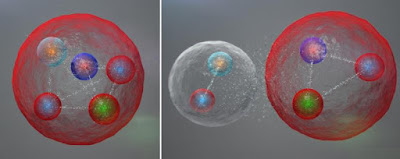
Murray Gell-Mann in 1964, described how the protons and neutrons that make up atomic nuclei are themselves composed of three quarks and how other particles known as mesons are made from pairs of quarks and their antimatter counterparts, antiquarks. Gell-Mann's scheme also pointed to the existence of pentaquarks, made up of four quarks and an antiquark. The LHCb collaboration at CERN has now found experimental evidence for the pentaquark's existence.

This illustration by Daniel Dominguez shows the possible layout of the quarks in a pentaquark particle. The five quarks might be tightly bound (left). They might also be assembled into a meson (one quark and one antiquark) and a baryon (three quarks), weakly bound together—a bit like two atoms combining to form a molecule:

possible layout of the quarks in a pentaquark particle

The "charmonium" pentaquark contains two up quarks, one down quark, one charm quark, and one anticharm quark.

Links: paper (724 authors) | press release

Tuesday, July 7, 2015

SWOT matrices in LaTeX

In marketing SWOT matrices are the bread and butter, especially in presentations and in market requirement documents. A SWOT matrix is a structured planning method used to evaluate the strengths, weaknesses, opportunities and threats involved in a product or feature. in an 18 October 2013 post I illustrated how colored blocks can be used to set SWOT matrices into type for Beamer.

TeX Live 2015 contains version 3.61 of the tcolorbox package by Thomas Sturm, which provides an environment for producing colored and frame text boxes with fine control of typesetting: the manual is 405 pages long! This provides an alternative method to set into type SWOT matrices.

In the document preamble we add

\usepackage[table]{xcolor}
\definecolor{swotS}{RGB}{226,237,143}
\definecolor{swotW}{RGB}{247,193,139}
\definecolor{swotO}{RGB}{173,208,187}
\definecolor{swotT}{RGB}{192,165,184}
\usepackage[raster]{tcolorbox}

With this, the template for a SWOT matrix is as follows:


\begin{tcbraster}[raster columns=2, boxrule=0mm, arc=0mm]
\begin{tcolorbox}[equal height group=A, size=fbox, colback=swotS!60, colframe=swotS!80!black, title=\textsc{strengths}]
\begin{enumerate}
\item business 1
\item business 2
\item business 3
\end{enumerate}
\tcblower
\begin{enumerate}
\item product 1
\item product 2
\item product 3
\end{enumerate}
\end{tcolorbox}
\begin{tcolorbox}[equal height group=A, size=fbox, colback=swotW!60, colframe=swotW!80!black, title=\textsc{weaknesses}]
\begin{enumerate}
\item business 1
\item business 2
\item business 3
\end{enumerate}
\tcblower
\begin{enumerate}
\item product 1
\item product 2
\item product 3
\end{enumerate}
\end{tcolorbox}
\begin{tcolorbox}[equal height group=B, size=fbox, colback=swotO!60, colframe=swotO!80!black, title=\textsc{opportunities}]
\begin{enumerate}
\item business 1
\item business 2
\item business 3
\end{enumerate}
\tcblower
\begin{enumerate}
\item product 1
\item product 2
\item product 3
\end{enumerate}
\end{tcolorbox}
\begin{tcolorbox}[equal height group=B, size=fbox, colback=swotT!60, colframe=swotT!80!black, title=\textsc{threats}]
\begin{enumerate}
\item business 1
\item business 2
\item business 3
\end{enumerate}
\tcblower
\begin{enumerate}
\item product 1
\item product 2
\item product 3
\end{enumerate}
\end{tcolorbox}
\end{tcbraster}

If you keep your data in a database, you can write a simple SQL program that can generate a market requirement document using this template and some boilerplate copy. The typeset result looks as follows.

A SWOT matrix set into type with the LaTeX tcolorbox environment

If this it too garish, you can always use a table environment and the following template:

\begin{table}[htbp]
\centering
%\topcaption{Table captions are better up top} % requires the topcapt package
\begin{tabular}{@{} p{0.10\textwidth} p{0.45\textwidth} | p{0.45\textwidth} @{}} % Column formatting, @{} suppresses leading/trailing space
\toprule
& \cellcolor{swotS!50}{\textbf{strenghts}} & \cellcolor{swotW!50}\textbf{weaknesses}\\
\midrule
\multirow{3}{*}{\textbf{business}} & SB1 & WB1 \\\cline{2-3}
& SB2 & WB2 \\\cline{2-3}
& SB3 & WB3 \\
\midrule
\multirow{3}{*}{\textbf{product}} & SP1 & WP1 \\\cline{2-3}
& SP2 & WP2 \\\cline{2-3}
& SP3 & WP3 \\
\toprule
& \cellcolor{swotO!50}\textbf{opportunities} & \cellcolor{swotT!50}\textbf{threats}\\
\midrule
\multirow{3}{*}{\textbf{business}} & OB1 & TB1 \\\cline{2-3}
& OB2 & TB2 \\\cline{2-3}
& OB3 & TB3 \\
\midrule
\multirow{3}{*}{\textbf{product}} & OP1 & TP1 \\\cline{2-3}
& OP2 & TP2 \\\cline{2-3}
& OP3 & TP3 \\
\bottomrule
\end{tabular}
\caption[SWOT template]{SWOT matrix caption.}
\label{tab:swot}
\end{table}

For the following look:

A SWOT matrix set into type with the LaTeX tabular environment

Wednesday, June 10, 2015

rating scales

In color science we sometimes have the need to elicit consensus information about an attribute. This is done with a psychometric scale. Usually we have a number of related questions. The term scale refers to the set of all questions, while the line typically used to elicit the response to a question is called an item. The tick marks on the line for an item are the categories.

When I get manuscripts to review, the endpoint categories are often adjective pairs like dark – bright or cold – warm. Such a scale is called a semantic differential. Essentially people put the term they are evaluating on the right side and on the left side they put an antonym. The common problem is that the antonym – synonym pair does not translate well from one language to another because they are culture dependent. Manuscripts in English reporting on work carried out in a completely different language are often difficult to assess.

The safe approach is to use a Likert scale, where the 'i' in Likert is short and not a diphthong, as it is typically mispronounced by Americans. In the Likert scale the extreme points for all items in the scale are strongly disagree – strongly agree. The question is now how many points the scale should have. When you need a neutral option the number is odd, otherwise it is even.

For the actual number I often see quoted 5 and 7, maybe in reference to George Miller's 7±2 paper (G. A. Miller. The magical number seven, plus or minus two: Some limits on our capacity for processing information. Psychological Review, 63(2):81–97, 1956). However, as such the answer is incorrect, and it is incorrect to use intervals of the same length between the categories.

The correct way is to do a two-step experiment. In the first step the observers are experts in the subject matter and the scale is a set of blank lines without tick marks or labels. These experts are asked to put a mark on the line to indicate how strongly they agree. You need about 1500 observations: if you have a scale with 10 items, you need about 150 experts. The number depends on the required statistical significance.

On their answers you perform cluster analysis to find the categories. This will give you the number of tick marks and their location. This allows you to produce a questionnaire you can use in a shopping mall or in the cafeteria to obtain the responses from a large number of observers. For more information on the statistics behind this, a good paper is J. H. Munshi. A method for constructing Likert scales. Available at SSRN, April 2014.

After you have evaluated your experiment and produced the table with the results, you need to visualize them graphically. The last thing you want to do is to draw pie charts: they are meaningless! Use a good visualizer like Tableau. If you use R, use the HH package. A good paper is R. M. Heiberger and N. B. Robbins. Design of diverging stacked bar charts for Likert scales and other applications. J. Stat. Softw., 57:1–32, 2014.

Tuesday, May 12, 2015

new green and blue laser sources

The lighting technology in our kitchen comes from Nichia LEDs. It required quite a bit of research, because the main light source in the kitchen is a large skylight oriented to south-east. Therefore, to work in the twilight of dawn and dusk, we needed both high efficiency in terms a luminance and a smooth spectrum compatible with D illuminants.

Recently, Nichia has developed laser technology that could make LCD televisions 25% more energy efficient than LED-based TVs. The major maker of LEDs has created a way to produce laser light that is 1,000 times stronger than laser light created through conventional methods, but which uses less power.

The company implemented semiconductor design changes that made it possible to create a laser system capable of emitting stronger blue and green light. The semiconductor device is made of gallium nitride, the same material used in LEDs. Green and blue laser light has traditionally been relatively weak and therefore is not used in many commercially available products.

Unlike light created by LEDs, laser light does not get diffused and thus can illuminate liquid crystal display TVs and PC monitors with far less power when used as backlighting — up to 50% in the case of PCs. Mitsubishi Electric and other companies have already developed red semiconductor lasers that can emit a strong light, but until now there had been no such system for green and blue lasers.

Nichia's breakthrough means semiconductor laser light is now available in the three primary colors. Nichia has begun shipping samples to consumer electronics makers and aims to commercialize the technology by 2016.

Source: Nikkei

Monday, May 11, 2015

non-locality

Researchers at the University of Tokyo have succeeded for the first time in verifying Einstein’s proposal of the non-locality of a single quantum: the idea that a single photon diffracted by a slit can spread over arbitrarily large distances, but is never detected in two or more places simultaneously.

This elusive phenomenon of non-locality in quantum mechanics, which has been termed “spooky action at a distance,” spurred a hundred years’ debate among physicists with Einstein’s proposal in 1909. Ever since, physicists have been making zealous efforts towards rigorous confirmation by highly efficient measurement devices. However, detection methods used so far have been for detecting photons as particles. In addition to low detection efficiency, since these methods can only detect the presence or absence of photons, it was theoretically impossible to rigorously verify Einstein’s proposal.

Graduate School of Engineering Professor Akira Furusawa, doctoral student Maria Fuwa and their collaborators utilized the wave-like degree of a photon as an electromagnetic wave and used a homodyne measurement technique to measure the photon amplitude and phase with high efficiency. They demonstrate it by splitting a single photon between two laboratories and experimentally testing whether the choice of measurement in one laboratory really causes a change in the local quantum state in the other laboratory.

This enabled the group to successfully verify the non-locality of a single photon with high precision and rigor. The experiment also verifies the entanglement of the split single photon even when one side is untrusted.

M. Fuwa, S. Takeda, M. Zwierz, H. M. Wiseman, and A. Furusawa. Experimental proof of nonlocal wave function collapse for a single particle using homodyne measurements. Nat Commun, 6, 03 2015.

Wednesday, April 22, 2015

Multilayer networks

Monday last week, on the 13th of April 2015, the 1999 Nobel laureate Günter Grass passed away. He grew up in what was then the free city of Danzig. Although Königsberg was farther east in Eastern Prussia, many of the memories of his youth he describes in the Tin Drum are familiar to me from my relatives' reminiscences. In fact, my grandfather emigrated from the Bernese Oberland to Königsberg to work as an agrarian engineer, ending up marrying a local girl.

A couple of centuries earlier another Swiss—Leonhard Euler from Basel—had also emigrated to Königsberg. Downtown, the river Pregel forms two large islands and seven bridges cross the river. In 1735 Euler posed himself the problem of whether it is possible to follow a path that crosses each bridge exactly once and returns to the starting point. In the process of tackling this problem, Euler invented graph theory.

Back in February 1996, I was given a week to write a blurb on what a company could do in terms of technology to monetize the freshly commercialized Internet. You can make money by making people more efficient, which can be achieved by allowing them to do their own work, or by allowing them to do new more valuable work. My employer lost interest and published the blurb, another company picked up the idea and ran with it.

The idea was that the World Wide Web is based on hypertext and therefore is a graph. You add value by adding weights to the edges of the digraph (Fig. 4 on p. 16). Once you have added the weights, you can build the minimum spanning tree (Fig. 5 on the following page). While it is very easy to get lost in a graph that is not minimally connected, resulting in tedium and frustration, in a tree there is a root (you can always go back to the beginning) and between any two nodes there is just one path. As opposed to a list, you can categorize the nodes by putting them in the same subtree, thus reducing the cognitive load.

At the time, I thought that you would have many instances of the graph, each one with different weights representing different criteria, like reading difficulty, subject matter, detail level, etc. Each one would yield a different minimum spanning tree and depending on what you would want to accomplish, you use one or the other.

In 1998 Brin and Page published their paper on "The Anatomy of a Large-Scale Hypertextual Web Search Engine." Pregel is Google's system for large-scale graph processing. There is an open-source counterpart to Pregel in Apache Giraph, although you would not expect to encounter a giraffe on the Pregel in Königsberg, not even in the zoo opened in 1896.

The following decade, as an associate editor for Optical Engineering, I often read papers where data from various frequency domains was fused to obtain much more useful images from remote sensing. Also in my activities at the Interactive Multimodal Information Management (IM2) Competence Center I learned that when dealing with hidden Markov models, by fusing various modes you could build much more powerful models.

Therefore, forget simple weighted digraphs. What you want is a multiplex network and you want to look at the trajectories of ergodic random walkers on multiplex networks. If you thing this is difficult, go back to the Baltic Sea where at Umeå University on the Gulf of Bothnia (more romantically, Bottnischer Meerbusen in German) they have developed Infomap, which makes it a child's play to reveal community structure by taking random walks.

detail of a visualization created with Infomap

Compared with conventional network analysis, multiplex Infomap applied to multilayer networks uncovers interplay between network layers and reveals smaller modules with more overlap that better capture the actual organization. Shoehorning multiplex networks into conventional community-detection algorithms can obscure important structural information, and earlier attempts at generalizing conventional community detection methods to identify communities across layers have proven problematic. In contrast, thanks to the map equation’s intrinsic ability to capture that sets of nodes across layers represent the very same physical objects in multiplex networks, the framework generalizes straightforwardly.

Monday, March 23, 2015

Deciding what to wear

For those seeking an AI perspective on fashion, Colorful Board Inc.’s Sensy app for smart-phones seeks to determine the optimum outfit based on the user’s tastes. “It’s like a fashion coordinator who chooses clothes for me as I’m too busy to spare time for selection,” said Sachi Okuyama, a 36-year-old company employee in Tokyo.

The Sensy app, launched in November, uses an AI system the Tokyo-based information technology venture developed jointly with researchers at Keio and Chiba universities. Users of the service download the free app and sort out whether they like the images of wear sent to their smart-phones once a day. The AI system analyzes replies from the user in accordance with color, shape, price and 47 other criteria to find out that person’s taste, such as “favoring pin-striped red wear of famous brands at sharp discounts.”

Colorful Board has tied up with more than 2,000 fashion companies and online commercial sites both at home and abroad for women in their 20s and 30s. Out of a huge number of dresses introduced on the Internet, the AI system recommends clothes to each user based on accumulated data. When users purchase recommended clothes, sellers pay commissions to Colorful Board.

Okuyama recently bought a gray one-piece suit using Sensy “The more the Sensy app is used, the better matches it can recommend because it learns every day,” said Yuki Watanabe, president of Colorful Board.

It would be interesting if Sachi Okuyama could try out Kokko's ColorSisters we described a month ago. This would inform us whether machine learning can beat an expert system based on the knowledge of experts. I can imagine that the answer will be culture-dependent: Japanese or Germans prefer to blend in and for them an estimate based on big data would be preferable. Americans like to stand out and Italian like to express their individuality, so I can imagine they would prefer the advice of fashion and cosmetics experts.

But then, Sachi Okuyama could be a rebel, so we need plenty of data.

Source: The Japan Times, Artificial intelligence apps guiding users’ clothing choices, culinary tastes.

Hakone sakimidareru


Hakone sakimidareru


咲き乱れる (click to enlarge; pink azaleas are completely out of gamut)

© 2015 Giordano Beretta. All rights reserved.


© 2015 Giordano Beretta. All rights reserved.


© 2015 Giordano Beretta. All rights reserved.


© 2015 Giordano Beretta. All rights reserved.


© 2015 Giordano Beretta. All rights reserved.


© 2015 Giordano Beretta. All rights reserved.


© 2015 Giordano Beretta. All rights reserved.


© 2015 Giordano Beretta. All rights reserved.


© 2015 Giordano Beretta. All rights reserved.


© 2015 Giordano Beretta. All rights reserved.


© 2015 Giordano Beretta. All rights reserved.


© 2015 Giordano Beretta. All rights reserved.


© 2015 Giordano Beretta. All rights reserved.


© 2015 Giordano Beretta. All rights reserved.


© 2015 Giordano Beretta. All rights reserved.


© 2015 Giordano Beretta. All rights reserved.


© 2015 Giordano Beretta. All rights reserved.


© 2015 Giordano Beretta. All rights reserved.


© 2015 Giordano Beretta. All rights reserved.


© 2015 Giordano Beretta. All rights reserved.


© 2015 Giordano Beretta. All rights reserved.


© 2015 Giordano Beretta. All rights reserved.


© 2015 Giordano Beretta. All rights reserved.


© 2015 Giordano Beretta. All rights reserved.


© 2015 Giordano Beretta. All rights reserved.


© 2015 Giordano Beretta. All rights reserved.


© 2015 Giordano Beretta. All rights reserved.


© 2015 Giordano Beretta. All rights reserved.


© 2015 Giordano Beretta. All rights reserved.


© 2015 Giordano Beretta. All rights reserved.


© 2015 Giordano Beretta. All rights reserved.


© 2015 Giordano Beretta. All rights reserved.


© 2015 Giordano Beretta. All rights reserved.


© 2015 Giordano Beretta. All rights reserved.


© 2015 Giordano Beretta. All rights reserved.


© 2015 Giordano Beretta. All rights reserved.


© 2015 Giordano Beretta. All rights reserved.


© 2015 Giordano Beretta. All rights reserved.